

Visualizing chronological events or project milestones directly within a document can transform a wall of text into an engaging, easy-to-understand narrative that captures your reader’s attention immediately. Whether you are a project manager mapping out a sprint, a teacher explaining historical events, or a student organizing a study schedule, learning how to create a timeline in Google Docs is an essential skill that enhances the visual impact of your work.
While Google Docs is primarily a word processor, it possesses robust, hidden features that allow for creativity, letting you design professional diagrams without needing external software or complex design tools.
By mastering these built-in drawing capabilities, you can keep your data and visuals in one place, streamlining your workflow and ensuring that your documentation remains cohesive, shareable, and visually compelling for any audience you intend to reach. In this guide on how to make timeline in google docs, we’ll provide you with a step-by-step tutorial on how to create visually appealing and interactive timelines within Google Docs.
Things You Need Before Creating a Timeline
Before starting to create a timeline in Google Docs, make sure you have the following essentials ready to ensure a smooth and efficient process:
A Clear Plan or Outline
Determine the purpose of your timeline and identify the key events, dates, or milestones you want to include. Having a structured plan will make it easier to organize your content.
Access to Google Docs
Sign in to your Google account and ensure that you have access to Google Docs. A stable internet connection is recommended for uninterrupted work.
Relevant Data
Gather all the necessary information, such as dates, key events, and any supporting details or descriptions you want to include on the timeline.
Visual Elements (Optional)
If you want to enhance your timeline, consider having icons, images, or other graphical assets ready to upload or integrate.
Basic Knowledge of Google Docs Editing Tools
Familiarize yourself with the basic drawing, shape, and text tools available in Google Docs to efficiently create and format your timeline.
With these items prepared, you’re ready to move on to the step-by-step process of building your timeline in Google Docs.
Different Ways to Make a Timeline in Google Docs
There isn’t just one single button to “insert timeline” in Google Docs, but there are several effective methods to achieve the result depending on your needs.
The Drawing Tool (Recommended for Customization):
This is the most flexible method. By using Insert > Drawing > New, you open a canvas where you can use lines, shapes, and text boxes to build a timeline from scratch. This allows for complete creative control over colors, spacing, and layout.
Smart Canvas “Project Roadmap”:
For a more structured, table-based timeline, you can use the “Building Blocks” feature. Go to Insert > Building blocks > Project roadmap. This inserts a table where you can track projects and statuses. While not a visual “line,” it serves the functional purpose of a timeline for project management.
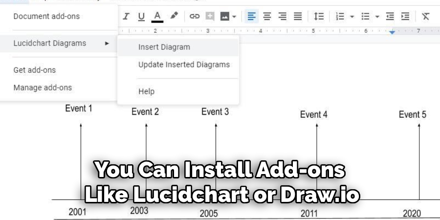
Third-Party Add-ons:
You can install add-ons like Lucidchart or Draw.io. These integrate with Google Docs and allow you to build complex diagrams in a dedicated app, then embed them into your doc. This is best for extremely complex timelines that require advanced diagramming features.
6 Simple Step-by-step Guidelines on How to Make Timeline in Google Docs
Step 1: Configure Your Page Orientation and Margins
The first step in creating an effective timeline is ensuring you have enough horizontal space to accommodate your chronological data without cramping the text or making the visual elements look squashed. By default, Google Docs opens in Portrait mode, which is excellent for writing letters but restrictive for linear diagrams that flow from left to right.
To fix this, navigate to the File menu at the top left of the screen, scroll down to select Page setup, and change the orientation to Landscape. This simple adjustment instantly gives you a wider canvas, allowing your timeline to breathe and making it significantly easier to fit multiple dates and milestones across the page without having to reduce your font size to unreadable levels.
Once you have switched the orientation, you should also consider adjusting your margins within the same Page setup menu. Standard one-inch margins might still eat up valuable screen real estate that could be better used for your timeline graphics. Consider reducing the left and right margins to 0.5 inches to maximize the width of your workspace. This preparatory step is often overlooked, but setting the stage correctly prevents frustration later on when you realize you ran out of room for that final, crucial event at the end of your timeline.
Step 2: Open the Drawing Tool Canvas
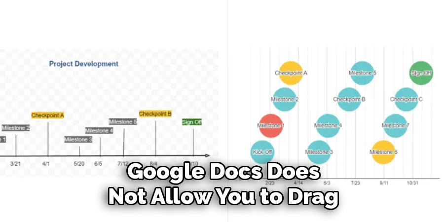
Google Docs does not allow you to drag and drop shapes directly onto the text page as easily as a design program would; instead, it uses a dedicated “Drawing” canvas that acts as a container for your graphics. To access this, place your cursor where you want the timeline to appear, then click on the Insert tab in the top menu bar. From the dropdown options, hover over Drawing and select + New.
This action will launch a pop-up window featuring a checkered background—this is your workspace. It is a self-contained design environment complete with its own toolbar for lines, shapes, text boxes, and images, distinct from the main Docs toolbar.
Using this specific drawing canvas is essential because it groups all your timeline elements into a single image file within your document. If you tried to construct a timeline using basic in-line text or tables, formatting would break the moment you added new text above it. Inside the Drawing window, you have the freedom to layer objects, group items, and move elements around with precision. Take a moment to familiarize yourself with the toolbar at the top of this pop-up window, identifying the line tool, the shape tool, and the text box tool, as these will be your primary instruments for the next steps.
Step 3: Draw the Main Timeline Axis
Now that your canvas is ready, it is time to draw the backbone of your timeline: the horizontal line that represents the passage of time. Select the Line tool from the toolbar (it looks like a diagonal line with two points). Click on the left side of your canvas and drag your cursor to the right side while holding down the Shift key on your keyboard.
Holding Shift is a critical pro-tip here because it forces the line to remain perfectly straight horizontally, preventing any jagged or slanted angles that would make your timeline look unprofessional. Once the line is drawn, you can use the formatting options to change the line weight (thickness) to 3px or 4px to make it stand out, and change the “Line end” option to add an arrowhead, signifying the continuity of time.
After establishing the main axis, you need to decide on the color scheme that fits your document’s purpose. A standard black line is professional, but using brand colors or thematic colors can add a nice touch. With the line selected, click the Line color icon (the pencil symbol) to choose your hue.
You can also duplicate this line if you need a parallel structure for comparing two different time periods. Remember, this line acts as the anchor for every other element you will add, so ensure it is centered in the canvas and leaves enough white space above and below it for your event markers and descriptive text boxes.
Step 4: Create and Distribute Event Markers
With your main axis in place, you need to add “nodes” or markers that indicate specific points in time. Select the Shape tool (the circle and square icon) and choose a shape that suits your style—circles and diamonds are the most common choices for timeline nodes.
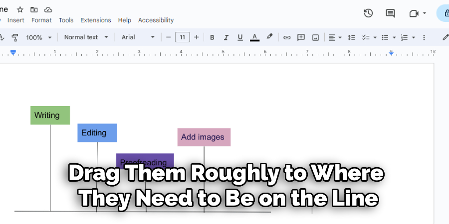
Draw your first shape onto the timeline axis. To ensure all your markers are identical in size, design one perfect shape first—adjust its fill color and border weight—and then use Ctrl+C (Copy) and Ctrl+V (Paste) to create duplicates for as many events as you need. This ensures uniformity across your graphic, which is key to a polished look.
Once you have all your shapes pasted onto the canvas, drag them roughly to where they need to be on the line. Accuracy is important here; if your timeline is to scale, the distance between markers should represent the time elapsed (e.g., a ten-year gap should be twice as wide as a five-year gap).
If the timeline is just sequential, you can space them evenly. Google Docs provides red “smart guide” lines that appear automatically when you drag objects; use these to ensure your markers are perfectly centered vertically on your main axis line. This alignment is crucial for visual balance and makes the difference between a messy sketch and a professional graphic.
Step 5: Insert Text Boxes for Dates and Descriptions
A timeline is meaningless without context, so the next step involves adding the textual data using Text Boxes. Click the Text Box tool (the box with a ‘T’ inside) and draw a small box near your first marker. Type the date clearly, for example, “Jan 2024”.
You can format this text just like you would in the main document—bolding the font, changing the color, or increasing the size for emphasis. It is often aesthetically pleasing to place the date on one side of the axis (e.g., above the line) and the event description on the opposite side (e.g., below the line) to prevent overcrowding.
After you have typed your first date and description, rather than drawing new text boxes for every single event, copy and paste your formatted text box. Drag the duplicates to their respective markers and simply edit the text inside. This technique guarantees that your font sizes and styles remain consistent throughout the entire graphic.
Be mindful of the amount of text you include; timelines are meant to be summaries. If you have a paragraph of information for one date, try to condense it into a headline for the timeline, and put the full details in the main body of your Google Doc. Keep the text inside the drawing canvas concise to maintain readability.
Step 6: Finalize, Group, and Save
Before you insert the timeline into your document, take a moment to review the visual hierarchy and alignment. Are the text boxes aligned with the markers? Is the spacing even? One helpful feature in the Drawing tool is “Grouping.”
You can hold the Shift key and click multiple elements (like a date, a marker, and a description), then right-click and select Group. This locks those elements together, so if you need to move an event further down the timeline, you can drag the whole group without leaving the text behind. This makes final adjustments significantly less tedious.
Once you are satisfied with your creation, click the blue Save and Close button in the top right corner of the window. Your timeline will instantly appear in your Google Doc as a single image.
If you notice a mistake later or need to add a new date, you don’t need to start over. Simply double-click the timeline image in your document, and it will reopen the Drawing canvas, allowing you to edit text, move shapes, or change colors. Finally, set the image text wrapping to “Break Text” so that it sits firmly on its own line without disrupting the flow of your paragraphs above and below it.
Following these steps on how to make timeline in google docs, you can easily create professional-looking timelines for your projects, presentations, or reports. However, there are some additional tips and tricks that you can use to enhance your timeline and make it even more visually appealing.
Common Mistakes to Avoid
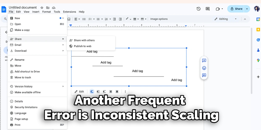
When creating timelines, many users overcrowd the canvas with too much text, rendering the graphic unreadable. Another frequent error is inconsistent scaling, where a gap of one year looks the same as a gap of ten years, which can mislead the reader about the duration of events.
Avoid using low-contrast colors, such as light yellow text on a white background, as this ruins accessibility. Finally, forgetting to group elements before moving them can lead to a messy, disjointed layout that is hard to fix.
How to Share, Download, or Print a Timeline
Once your timeline is complete, you might need to share it outside of Google Docs. To print, simply go to File > Print, but ensure your printer settings match the landscape orientation if you changed it earlier.
To download the timeline as a standalone image, you cannot do this directly from the Docs view; you must double-click the timeline to open the Drawing tool again, then use Actions > Download to save it as a JPEG, PNG, or SVG file. If you are sharing the document digitally, click the blue Share button at the top right, and adjust permissions to “Viewer” so others can see your timeline without accidentally moving or deleting your carefully placed elements.
Timeline Use Cases
Timelines are incredibly versatile tools applicable across various industries and tasks. In Education, teachers use them to map out historical events or plot the plotline of a novel for literature classes. In Project Management, timelines (or Gantt charts) are vital for visualizing product roadmaps, sprint schedules, and deliverable deadlines.
Business Professionals use them in company histories for “About Us” pages or annual reports. Even for Personal Organization, timelines help in planning weddings, travel itineraries, or study schedules for upcoming exams, providing a clear linear path to success.
Frequently Asked Questions
Q1: Can I Use a Pre-Made Template for Timelines in Google Docs?
Yes, absolutely. While building one from scratch gives you more control, Google Docs offers a few basic templates. You can find them by going to Insert > Building blocks > Project roadmap for a table-style view. Additionally, third-party template galleries often offer specific timeline templates that you can copy and paste into your document, which can save you significant time if you do not require a custom design.
Q2: What Happens if My Timeline is Too Wide for the Page?
If your timeline extends beyond the page boundaries, the Drawing canvas will automatically scale the image down to fit the width of the document when you click “Save and Close.” This can make the text tiny and unreadable. To fix this, try to split your timeline into two separate drawings (Part 1 and Part 2) stacked vertically, or change your page orientation to Landscape to gain more horizontal width for a single continuous line.
Conclusion
Creating a timeline in Google Docs is a powerful way to visualize data without needing expensive design software. By utilizing the Drawing tool and following the steps outlined above, you can turn abstract dates and deadlines into a clear, professional visual story.
While it requires a bit of manual setup compared to dedicated timeline software, the ability to keep your graphics integrated directly within your reports or assignments is a massive productivity booster. We encourage you to open a blank document today and try building a simple timeline—you will be surprised at how easy and effective it can be to bring your chronological data to life. Thanks for reading this guide on how to make timeline in google docs.
About
Josh Stone is a distinguished figure in the world of software engineering and digital architecture, with a decade of expertise creating innovative and scalable software solutions. His professional focus lies in merging legacy system stability with modern agile development, fostering applications that are both high-performing and user-centric. As an authoritative voice in the tech space, Josh Stone delves into the art and science of clean code and systems design, inspiring developers and industry leaders alike.
Education
RMIT University (Melbourne, Australia) Associate Degree in Software Development Focus on sustainable codebases, industry-driven projects, and practical programming. Gained hands-on experience with full-stack frameworks, database management, and cloud infrastructure.
Nottingham Trent University (United Kingdom) Bachelor’s in Computer Science and Systems Design (Honors) Specialized in software architecture with a focus on blending creative UI/UX with robust backend production techniques. Participated in high-level industry projects, collaborating with global tech firms to gain real-world insights into enterprise-level deployment.
Publications and Impact
In his technical writings, Josh Stone shares his insights on agile design processes, emerging languages, and strategies for efficient DevOps. His work bridges the gap between theoretical computer science and modern industry needs, making it a must-read for both budding programmers and seasoned software architects.